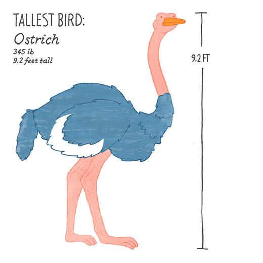
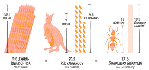
My most recent illustration series for BuzzHootRoar—and my first series as their new Artist in Residence—went live last week! BuzzHootRoar is a team of scientists that run a “graphics-driven blog that shares and explains a scientific concept in 300 words or less”. My illustrations accompany an article describing “how many of the biggest, longest, or tallest animals in their class (or order or family!) it would take stacked end-to-end to reach the top of some of our favorite landmarks.” You can see all the illustrations I created (there are 15 total!) and read the article over on the BuzzHootRoar website. And here’s a bit of process work to show how I created the series.
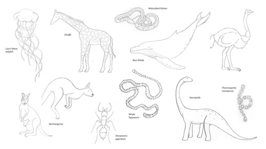
First, I was given the text and data chart with the animal species, landmarks, and heights. I researched the animals and sketched out different variations of each. Above are the final drawings for each animal I was to illustrate.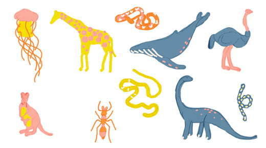
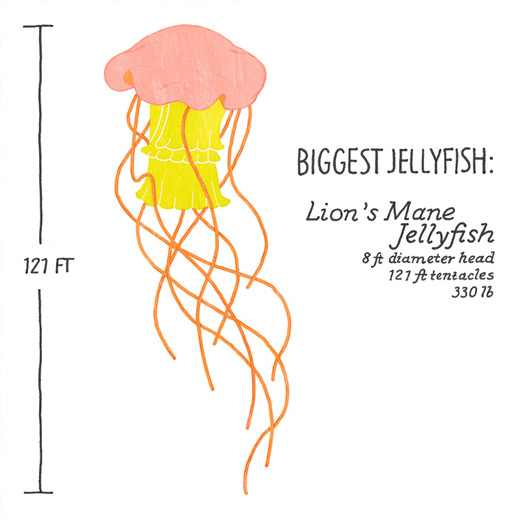
Then I popped those sketches in Photoshop and play around with colors, making lots of quick color studies. The shot above it the color study I ended up using as the reference for the final illustrations. Here are a few of the final animal illustrations complete with color and texture:
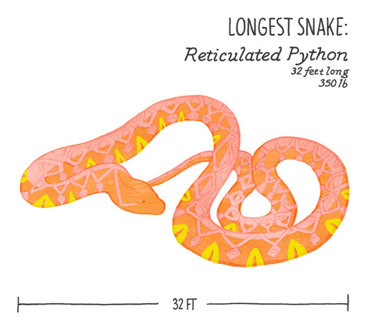
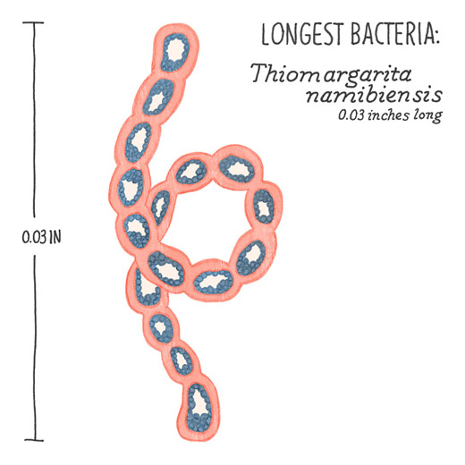
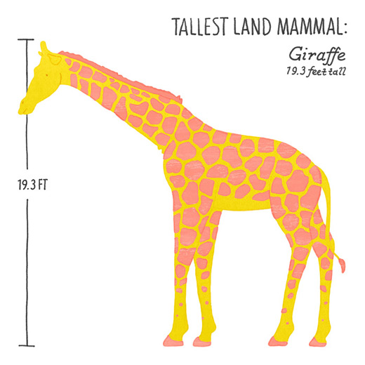
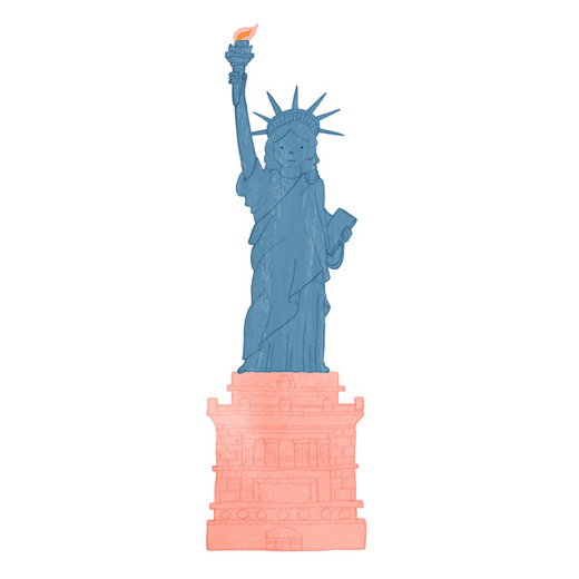
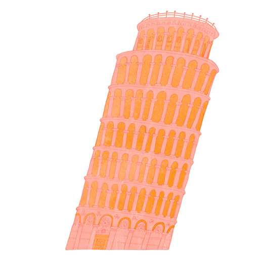
After (and kind of simultaneously), I illustrated the landmarks and then applied color and texture digitally. 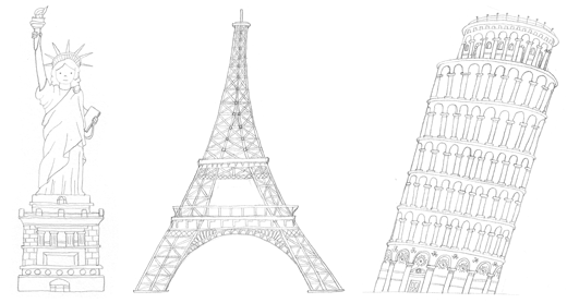

One tricky part to this series, was organizing the comparison illustrations. We wanted 10 single illustrations of the animals, explaining which category they were in (tallest bird, etc.), but we also wanted 5 illustrations that compared the animals to landmarks, showing how many of each animal it would take to reach the top of the landmark. This was a challenge because I only had so much space to work with so I had to make the layout small enough to fit on their blog, but large enough to be legible, and to let each piece of the illustration breathe a little. I experimented with tons of different layouts, going back and forth with the BuzzHootRoar team and getting their feedback as well. Here’s a little GIF of the process of finding the right layout, and getting everything spaced just right! It was definitely a challenge, but I think we ended up with something that really works!
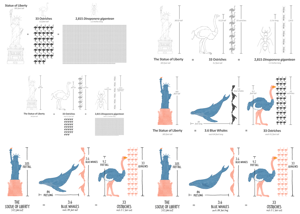
After I had the layout finalized and approved, I moved on to hand-drawing the typography. This takes quite a bit of time (and actually a lot of concentration), but I just love the feeling of hand-drawn type. I think it gives my illustrations a feel of humanity, warmth, and approachability. And it’s like putting even more of my personal thumbprint on the illustration.
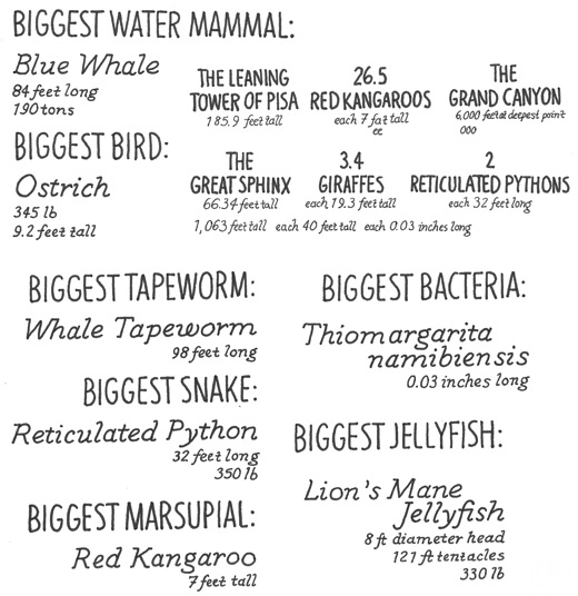
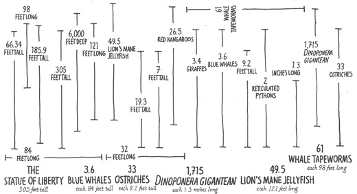
From there, I assembled the illustrations, double-checked spelling, spacing, and continuity between each piece, and sent them off!
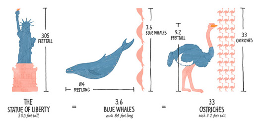
Thanks for reading, and remember, you can see all the full series and read the article over on the BuzzHootRoar website!
P.S. Here’s a little sneak peek of something else I’m working on currently!
