Today, I thought I would post a little walk through of my process of making an illustration. I’ve been working to refine this process to get it to yield the highest quality illustration while also being efficient. I try to keep good track of the process so that I can change things as I explore and refine. It seems to me that the illustration community as a whole is very open and willing to share inside peaks into their processes and the tools they use. This is in contrast to the graphic design community where it seems most designers are more secretive and protective of their processes and tools. I realize neither of those sentiments is true for everyone, but its just a general feeling I get from the two professions. Anyways, I thought I’d join in and share my illustration process even though it’s probably not the best out there, nor is it my permanent process—this an evolving thing as I’m sure it is for most.
Step 1: Sketching the Ideas
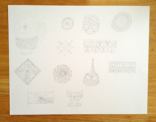
The piece I’m using for this process post is a personal illustration I created recently with the purpose of refining my inking skills and focusing on using paint and digital techniques to apply texture and interest to the piece, as well as creating interesting patterns and repeating details. I started out by just sketching some ideas—not focusing too much on a single idea—just putting everything in my mind on the page. I started this set of sketches with the intention of inking them (to practice and refine my inking skills) so I drew them on bristol board instead of in my sketchbook as usual. This is just one page of the sketches I did in this sitting.
Step 2: Inking the Line Work
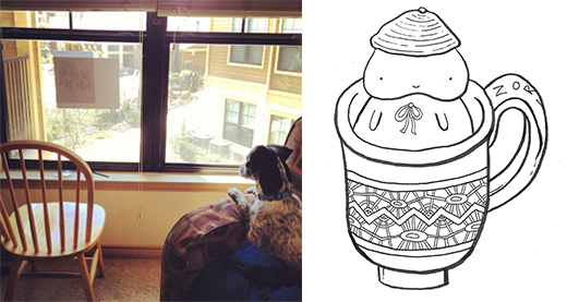
After I feel like I have a sketch worthy of continuing with, I’ll either refine that sketch working on the line work and adding details, or I’ll draw a few different options of that one sketch. Once that is complete, I move on to inking. For the process of inking I have two options. If I need the inked image to be larger than the size of the original sketch, I will scan the sketch into my computer, enlarge the sketch in Photoshop, and then print it out on printer paper. Then I tape the enlarged sketch to a window (AKA: my free Texas lightbox) as seen above on the left, and trace the lines in pencil onto bristol board. The I sit at my drawing desk and ink the drawing.
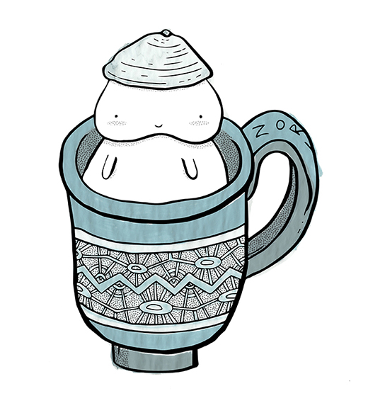
If I don’t need the inked image to be larger than the sketch (I actually prefer to work smaller when working by hand) then I will ink the drawing onto tracing paper over top of the sketch. Once I have the inked drawing, I scan it into my computer at 600 dpi, seen above on the right.
This step is super meditative for me, as it takes a lot of concentration, and pen control. I really enjoy the process of inking and I love the crisp feel it gives my illustrations. I try to focus on having clean, organic lines that have varying line widths. I achieve this by using a range of brush pens and artist pens. My chosen pens at the moment are Faber Castell pens including: two widths of brush pens, a chisel pen, bullet nib pen, and five widths of artist pens. I usually have at least 3 line widths in an illustration, and sometimes as many as 5.
Step 3: Painting the Textures and Colors
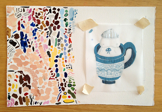
This step is like a breath of fresh air after having just inked the drawing which takes such concentration and tight pen control. I usually trace the sketch/inked drawing onto another piece of bristol board or water color paper to paint, but in this case I wanted to explore and see what would happen if I painted on tracing paper. So I taped a piece of tracing paper over a printed out version of the original sketch and painted the background colors of the piece. The technique turned out pretty interesting, and added some extra interest with the subtle rippling of the paper. I try to keep everything pretty loose when I’m painting, so that these colors and textures really contrast with the controlled line work from the pen and ink. Once I’ve painted everything I want to (which might involve painting multiple versions with the elements separated out) I scan the painted piece into my computer.
I use gouache paint which I usually thin out to almost act as water color. I like the versatility of gouache in that I can use it thick like acrylic or thin like water color. When I’m working with the thin paint, I have to work fast because it dries quickly, so that helps my stokes stay loose. I also like being able to see the subtle paint strokes, colors mixing, and a bit of paint outside the lines. If I wanted the color to be flat, I would apply it digitally! I want my illustrations to have that imperfect hand made feel.
Step 4: Digitally Combining the Elements and Adding the Finishing Touches
Now that I have all hand made elements of the illustration on my computer, I can start compiling them digitally. Sometimes I will scan in pages with broad paint strokes that I can use to apply more texture and color. I play around with adjusting the colors and details a bit, and apply more subtle texture using either digital patterns, or drawn patterns that I have scanned in. This stage is a lot of exploration, using mistakes and accidents to lead to interesting outcomes.
Welp, that’s about it! I hope you enjoyed this look into my evolving process! I really enjoy the process of making an illustration and find it deeply meditative and fulfilling. Each part has its own feel and satisfies my hands and brain in different ways, and I try to take care to document the process of most things I create. Thanks for reading!
